
Welcome to a New Year, may 2019 bring love, health and kindness …and many more card making adventures! This month at CAS Mix Up we’re starting with the Bokeh technique. There are plenty of videos for you to try this technique, plus so many incredible creations from this great design team.
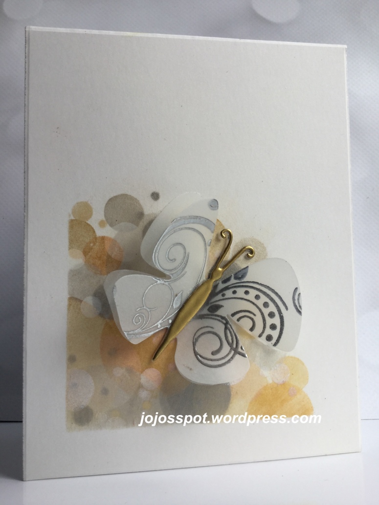
For the first card, the bokeh was created by sponging PanPastels through a DIY circle stencil in the colours of Light Gold, Rich Gold, Silver and Pewter. I also added frost white Colorbox pigment ink at the end. For the Penny Black flutter Vellum die cut, I stamped and silver heat embossed a Technique Tuesday stamp called Fanfare. The body of the butterfly was gold heat embossed several times.
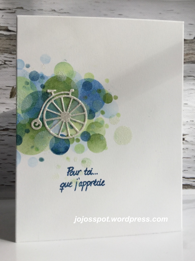
For the second Bokeh card, I sponged Memento Ink in blues and greens through my DIY stencil. I finished with white Colorbox pigment ink and decided to add glitz EP. A white glitter paper penny farthing die cut from Tattered Lace was added. The sentiment, “Pour toi… que j’apprécie” (For you… who I appreciate) was stamped and also glitzed 😀
Do join in on the fun with Bokeh + stamping +*Your Choice. There’s plenty of inspiration and videos to get you started. Thanks for stopping by, HUGz,


Love how you’ve restricted the bokeh to a small area on the cards, it creates such an impact! Your butterfly card is stunning and I love the colours on your 2nd card, Cathy x
LikeLiked by 1 person
Love how you used colour to create your Bokeh effect Joanna, it looks amazing on both cards. Happy New Year!
LikeLiked by 1 person
Two very pretty bokeh cards Jo, and the first using Pan Pastels in the metallic shades works well with the lovely butterfly, and the blue and green distress inks complement your white glitter paper penny farthing really well. x
LikeLiked by 1 person
I love this approach to bokeh – using color and only covering a portion of the panel. You’ve inspired me!
LikeLiked by 1 person
These are so lovely, colours, layout, technique, everything.
LikeLiked by 1 person
Hi Jo. I’ve been missing you and hope you had a wonderful time in Mexico and a lovely holiday with your loved ones! Your Bokeh cards are both creative and beautiful! I love how you’ve done the circles in different colors as well as the white! The butterfly is exquisite with the stamping on the wings and dreamy sheer wings! Love the fun cycle and blue and green of the second card! As always, super creative and fun!
LikeLiked by 1 person
I love the idea of using bokeh on just a portion of the card. Your colors are gorgeous, showing that bokeh doesn’t have to be white circles only.
LikeLiked by 1 person
Gorgeous bokeh! Amazing designs – love them both
LikeLiked by 1 person
Two wonderful examples of bokeh – and beautiful colour combinations too! Love the layered vellum butterfly!
LikeLiked by 1 person
Joanna, I love the combination of the PanPastel metallic colors and the white pigment ink to create the beautiful Bokeh effects! It’s so stylish. And the vellum wings and the gold heat-embossed body of the butterfly are just amazing! The second card is also wonderfully designed – color combo, layout, adding glitz EP, glittery die-cut. The card is full of all these excellent choices.
Happy New Year! 🙂
Hideko xx
LikeLiked by 1 person
I love both of these Joanna! Wonderful earthy colors on the first with your beautiful butterfly – and the blues and greens look lovely with your fun die cut bicycle! I miss the Mix team already – but look forward to the Stencil challenge on the 4th! Julia xx
LikeLiked by 1 person
The card is a stunner Joanne, both are, the use of different colours for the Bokeh technque is beautifully – love your combination of colours
LikeLiked by 1 person
Simply beautiful Clean and Simple card designs, Joanna. I love how you used neutral bokeh circles and a gorgeous heat embossed die cut butterfly on your 1st card. Your 2nd card is just as gorgeous with the beautiful colored circles. Two beautiful and creative cards, my friend. I have loved being on the same DT with you, but will still be playing often and being inspired by your uniquely clever CAS designs. Hugs..Nancy
LikeLiked by 1 person
CAS perfection Jo, your colour combo’s are stunning. you have such an eye for colour and layout 🙂
LikeLiked by 1 person
WOW! Two BEAUTIFUL cards Joanna! LOVE the metallic colours of your first card. The bokeh design in the corner is so pretty and it’s as if the butterfly is emerging from it. Gorgeous vellum butterfly with heat embossed design and body. An amazing an inspiring design! Your second card is also incredible. Great mix of colours for your bokeh design. The penny farthing bike cut from glitter is fun and whimsical. xx
LikeLiked by 1 person
Such a glorious effect of the technique on both of your wonderful cards. The first card is so pretty and the colours you’ve used look so beautiful and Wow to that butterfly. The glitz looks so pretty on your second card and the design is wonderfully CAS….Happy New Year my blog friend x
LikeLiked by 1 person