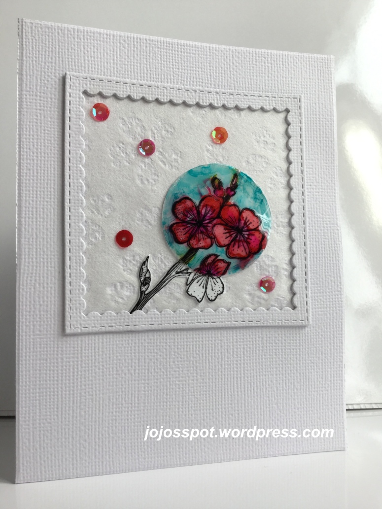
 A reminder ACETATE card for the CAS Mix Up Challenge. You still have time to play, the challenge runs up to March 24th. For this card, I was inspired by my good friend Bonnie‘s card and I wanted to try the “Spotlight Technique”. I first stamped onto white card stock, with Versafine ink, an apple blossom branch which I clear heat embossed. Then I stamped the same stamp with StazOn black ink onto a die cut circle piece of acetate. On the opposite side I tried to colour with Copics but this technique just didn’t seem to work for me. So I took out the Alcohol Inks and using a paint brush I applied the colours. Without sealing the inks I added Glossy Accents to adhere it to my stamped card stock. The colours moved around but it left an interesting loose look to it, so, with my scissors, I fussy cut the image. Using a MFT Stitched Square Scallop Frame, die-cut 3 times, I added a piece of Japanese paper as the background, finishing my card with 5 sequins.
There are lots of inspiration to be found by the Design Team and some videos to give you tricks and tips. Hope to see you in our gallery, HUGz,


This is such a pretty spotlight effect using the alcohol inked acetate Joanna, and I love the japanese paper in the background of that delightful scalloped frame, and love the added sequins too. x
LikeLiked by 1 person
I love your spotlighted pretty cherry blossoms, Joanna! It’s so interesting to see how the colors moved around on the acetate. It’s a nice touch that the background Japanese paper also has cherry blossom patterns. Hideko xx
LikeLiked by 1 person
Gorgeous card, love the softness of the paper background with the crisp spotlighted image, it’s such a pretty design, Cathy x
LikeLiked by 1 person
Joanna, beautiful spotlight technique, I love the gloss and the bright colours of the acetate against the perfect CAS background.
LikeLiked by 1 person
I loved your spotlighted cherry blossoms colored with alcohol inks, Joanna. Such a beautiful image made even prettier with your textured Japanese paper and textured framing and card front. I would love to see and touch your gorgeous card IRL:-) TFS my friend. Hugs
LikeLiked by 1 person
I always look forward to seeing how you created your masterpiece, my friend! Your spotlight stamp is gorgeous and much more artistic than mine! It’s so pretty on the Japanese paper! I need to stop hoarding and use some. It’s so pretty though, I enjoy looking at it!
LikeLiked by 1 person
Such a great way to spotlight this sweet image Jo! The acetate makes the colours bright and shine. And it all looks so pretty on the Japanese paper background. xx
LikeLiked by 1 person
Love the texture of your white cardstock Joanna – and the lovely colors on your wonderfully glossy blossom spot light piece! Julia xx
LikeLiked by 1 person
What a clever idea to use acetate for the spotlight technique – it really suits that technique. Love the soft, slightly loose look of the colouring. Great background paper, framing, and scattering of sequins. Thanks so much for creating such a beautiful card for the challenge I’m hosting!
LikeLiked by 1 person
Love how the alcohol inks moved around slightly when you used the glossy accents, such a unique a gorgeous effect on the acetate. Always so inspirational, always so very creative and such a beautiful card, with lots of fun mixed media elements x
LikeLike