 It’s that time of gratefulness,
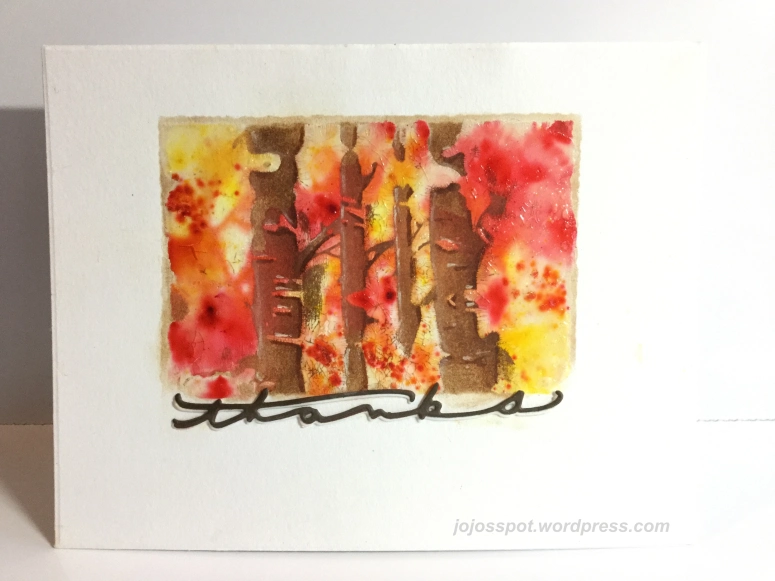
  which is the theme at CAS-ual Fridays CFC187 & TIME OUT’s Challenge #97. So I created this card with Color Throwdown’s countdown #470 palette. Using a Crafter’s Workshop Aspen Stencil I added Brushos (lemon, orange & brilliant red) over a masked part of my Bristol card base. I spritzed with water and came up with a
  colourful
  autumn scene. Once dry, I applied a shiny layer of Distress Crackle Paint for the Less Is More Recipe #356 and waited for this layer to dry 😛 Then I blended in some Distress Ink vintage photo to allow the tree trunks and branches to appear. Penny Black’s word die “thanks” was die cut in white and brown and adhered just under the forest. Hope you’re having a joyful Thanksgiving, filled with love and family!
Thanks for stopping by, HUGz, Joanna

What a lovely work of art. Loving the firey colours! Thank you for sharing with us at Time Out. Jenny x
LikeLike
Thank you so much Jenny x
LikeLike
Wonderful color, dimension and shine! Wow!
LikeLike
This looks amazing! I love your blend of colors, the scene you created and the clean layout. Beautiful two-tone sentiment too. Thanks for joining us at Less Is More and TIME OUT!
LikeLike
Thank you Nonni, it was crazy fun 😛 xx
LikeLike
LOVE this design, Joanna. I have been looking at my Rock Candy crackle from Tim Holtz and thinking I need to use it again … and bang, there is your card! I love how it looks over your brushos background. Beautiful card! xx
LikeLike
Hahaha great minds run on the same channels, we must have had the container in our hands at the same time 😉. Just remember to shake it well & add water if it’s too thick, …this I read after 😂
LikeLike
Wow, I love this Joanna! Beautiful! Thanks for playing along with us at CAS-ual Fridays.
LikeLike
thank you Michelle xx
LikeLike
Such a terrific design. Thanks for sharing at Less is More!
LikeLike
…thanks… xx
LikeLike
Totally beautiful!!! Thank for joining us at The Color Throwdown!
LikeLike
What a gorgeous card, Jo! Love this technique since it provides such vibrant and bold colors! Thanks for joining the CAS-ual Fridays Challenge!
LikeLike
Thank you Marcia 😉
LikeLike